Somewhere out there is a student with a calculus exam in two weeks and a problem that has nothing to do with calculus.
They did everything right. They went to the lectures, worked the problem sets, kept notes — real notes, the good kind, the kind with worked examples and little arrows in the margin that say this is basically the chain rule again. By week ten they had a beautiful pile. Composite functions here, the Fundamental Theorem over there, three separate pages that all somehow lead back to limits.
And that was the trouble. Everything led back to something else. The notes were correct and complete and completely impossible to hold in your head all at once. You’d revise integration by parts, notice it was secretly the product rule wearing a disguise, flip back forty pages to check, and by the time you got there you’d forgotten why you were looking. The subject wasn’t a list. It was a web. And a linear stack of paper is a terrible way to store a web.
So the student had the idea that every student eventually has: what if I could just see the whole thing? One map. Every topic, every connection, laid out so the shape of calculus became obvious at a glance.
The sensible choice: just use Mermaid
If you’ve spent any time near documentation, you reach for Mermaid here. It’s the sensible default — text in, flowchart out, no fiddling with boxes and arrows by hand. You write A -->|leads_to| B and it draws the arrow for you. Clean. Standard. What could go wrong.
The student got to work. They went through every note, pulled out every term — Function, The Limit, Derivative, Riemann Sums, Newton–Raphson, the whole cast — and wrote down how each one related to the others. consists_of. leads_to. corresponds_to. It was genuinely good revision, honestly. Naming your relationships forces you to actually understand them.
A hundred-odd nodes and two hundred-odd edges later, they had a tidy block of Mermaid source. Every relationship in the course, captured. They hit render, leaned back, and waited for calculus to reveal its hidden geometry.
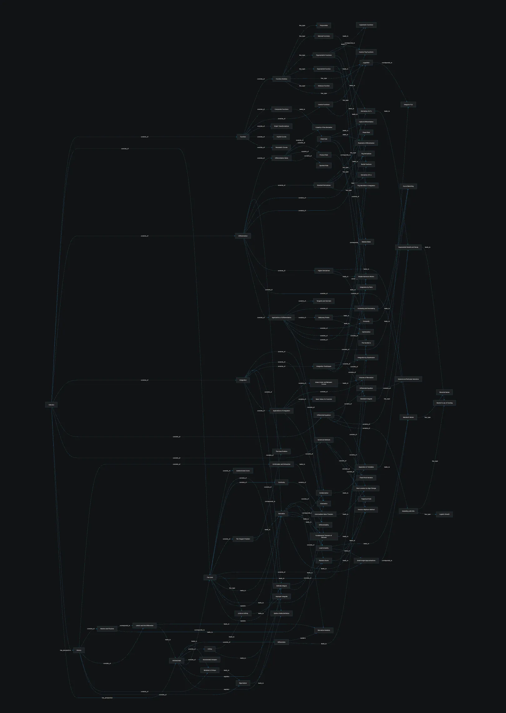
Behold: the hidden geometry of calculus.
That’s the whole thing. Every node is in there. Technically, this is a complete and accurate map of the course. It is also completely useless. It’s a hairball — a vertical avalanche of identical grey boxes threaded together by lines that cross so many times the arrowheads give up trying to mean anything. You cannot read a single label without zooming. You cannot follow a single edge without losing it behind six others. Somewhere in that tangle is the relationship between the Chain Rule and Integration by Substitution, and you will die before you find it by eye.
“Fine,” said the student, who was not yet ready to admit defeat. “I’ll just zoom in.”
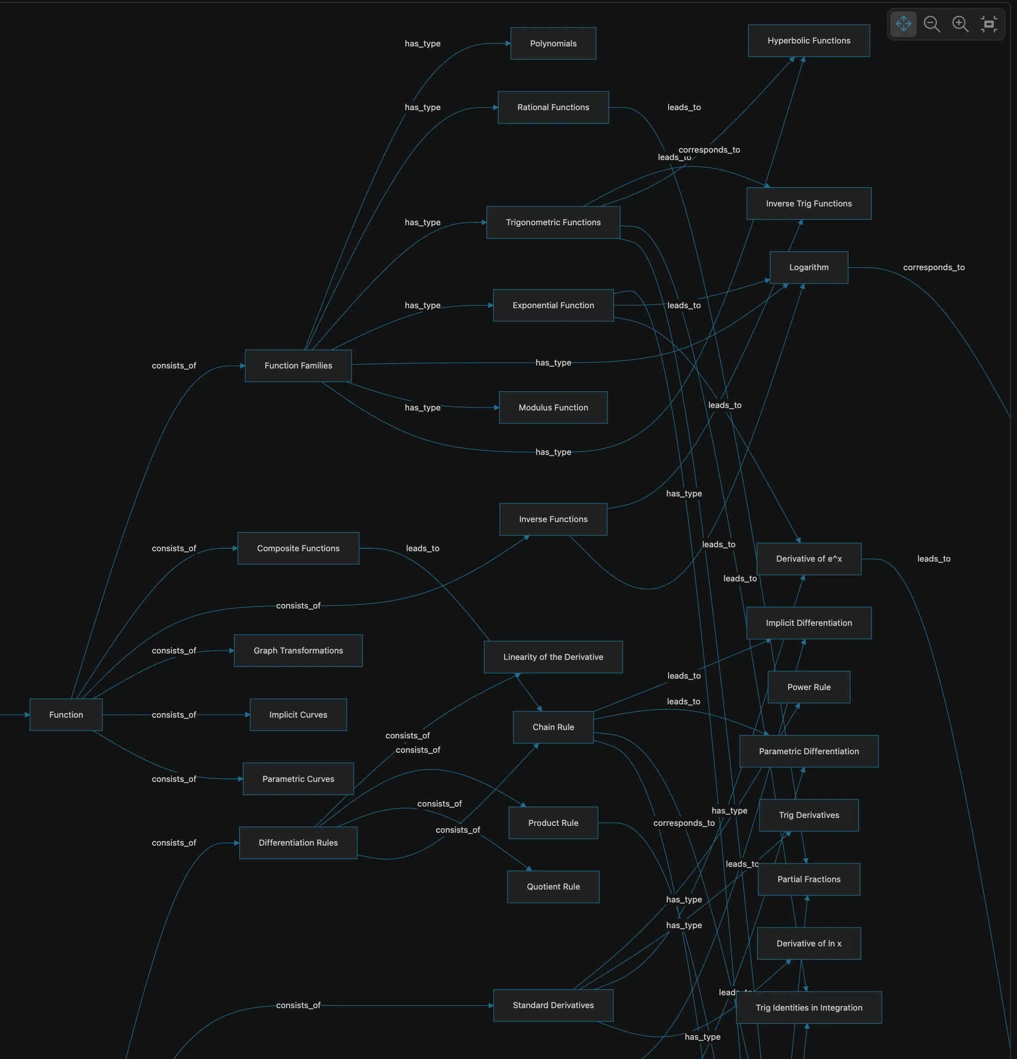
Up close it is exactly as tangled, only now you can’t see the rest of it.
This is the trap. Zoom out and you can’t read anything; zoom in and you can read four boxes while the other hundred and forty-six vanish off the edges of the screen. You spend your whole revision session panning around a diagram the size of a car park, trying to remember whether Standard Derivatives was up-and-to-the-left or down-and-to-the-right of where you currently are. You never once feel like you’re somewhere. You just feel lost, in a place you built yourself.
Why the tool wasn’t the problem
Here’s the thing, and it’s worth being fair to Mermaid: it did exactly what it was asked. The tool isn’t broken. The shape of the request was.
A flowchart is a wonderful way to draw a process — something with a start, a finish, and a current-you-are-here somewhere in between. Deploy pipelines. Login flows. Decision trees. Things that go from A to B.
Knowledge doesn’t go from A to B. Knowledge is dense, cross-linked, and cyclic — the Derivative leads to the Fundamental Theorem which leads to Integration which loops right back through Antiderivatives to the Derivative again. Ask a flowchart to lay that out on one flat plane and it has no choice but to produce a hairball, because there is no left-to-right order that a genuinely web-shaped thing can be flattened into. The problem was never the renderer. The problem was trying to see a graph through the keyhole of a single canvas.
Which brings us, with only mild narrative convenience, to the point.
The same diagram, in Knogra
Knogra imports Mermaid. Not “recreate your diagram from scratch in our format” — it reads the same -->|consists_of| source the student already wrote. So the two hours of relationship-naming weren’t wasted; they got pasted straight in. Same nodes. Same edges. Same graph.
The difference is what Knogra does with it. Instead of squashing the entire web onto one plane, it treats the graph the way you actually think about it: one neighbourhood at a time. Every node can be the centre of its own little scene, showing just itself and its immediate connections. You move through the graph by stepping from scene to scene — the way you’d walk through a building rather than staring at the floor plan.
Start at the top.
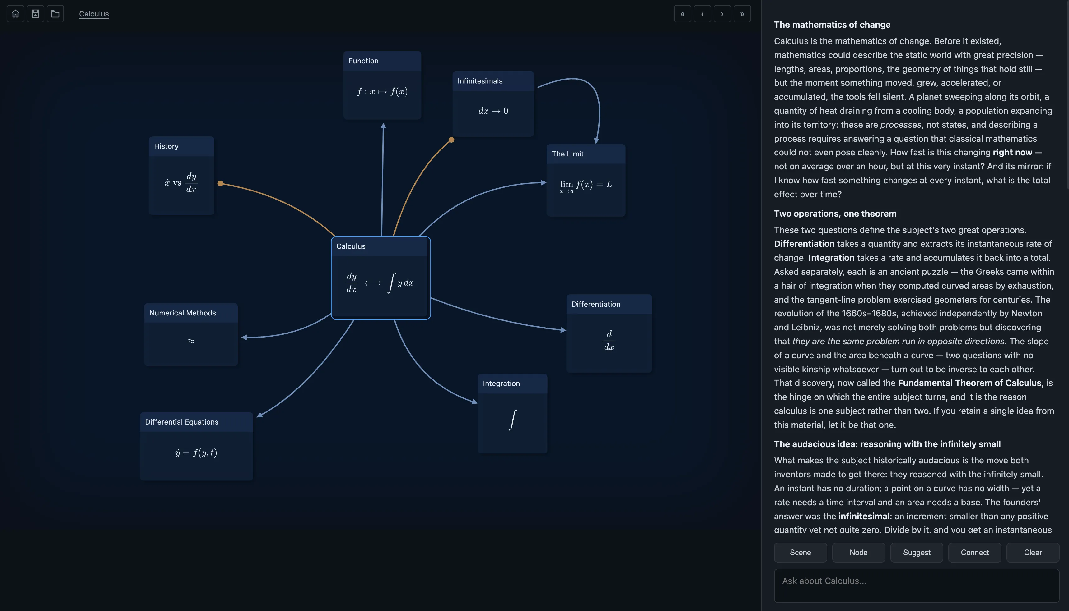
The root scene. The entire course, on one screen, without a single crossing edge.
This is the same information that was drowning in the hairball — but here it’s the opening view of the subject, not a crime scene. Calculus sits in the middle. Its great pillars fan out around it: Function, The Limit, Differentiation, Integration, Differential Equations. Each box carries an actual rendered formula, not just a name — the central node literally shows dy/dx ⟷ ∫y dx, the whole duality of the subject in one glyph. And the panel on the right is a written explanation of the mathematics of change, generated in place, so the map doubles as something you can read rather than just point at.
Now the part the flowchart could never do. Click Function, and you don’t zoom — you step into it:
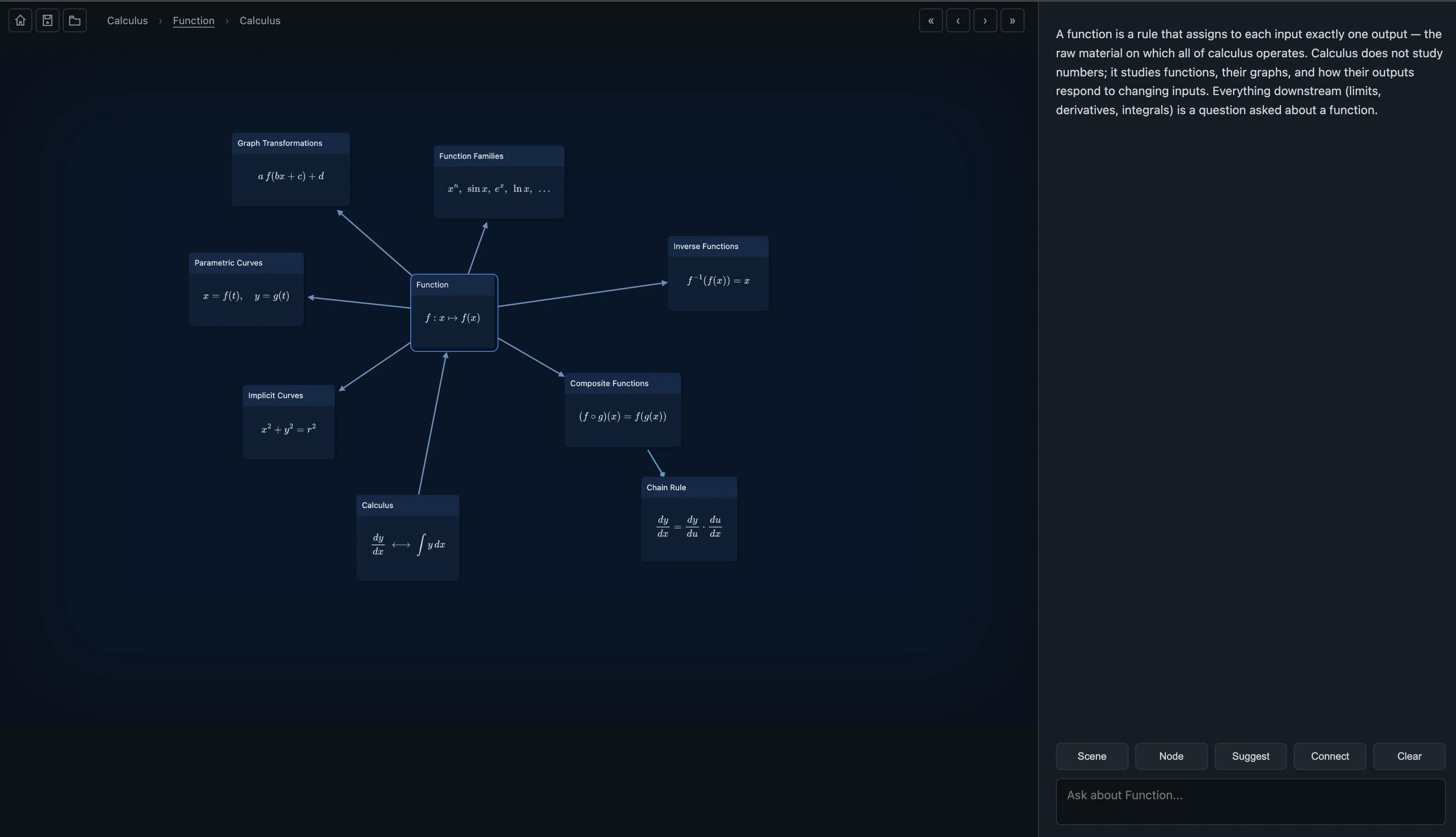
One step down. Function and only its neighbours — and a breadcrumb so you always know where you are.
Look at the top: Calculus › Function. You are somewhere. You stepped down one level and the view reorganised itself around your new location, showing Function’s own little world — its families, its composites, the Chain Rule hanging off to the side. Everything irrelevant to right now is politely offscreen, not deleted, just not in your face. This is the thing panning around a giant PNG can never give you: a sense of place, and a trail of breadcrumbs back out.
Step in once more, into Function Families:
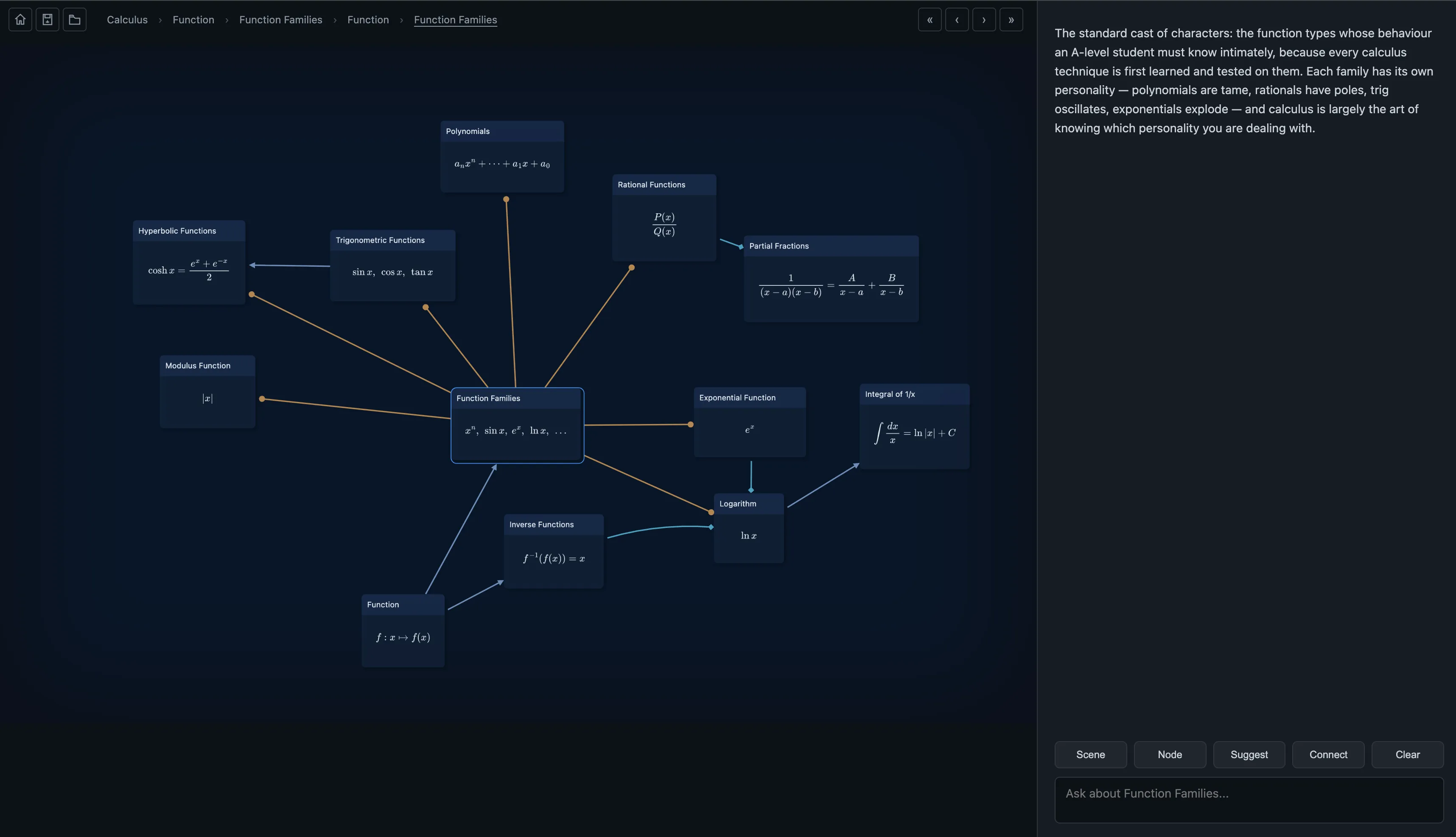
Two steps deep: the standard cast of characters, each with its defining formula rendered in place.
The full menagerie — polynomials, rationals, trig, hyperbolics, the exponential and its shadow the logarithm — each showing the formula that defines it: cosh x = (eˣ + e⁻ˣ)/2, ∫ dx/x = ln|x| + C, the lot. This is the exact same corner of the graph that, in the Mermaid render, was an indistinguishable clot of grey boxes near the top-right you’d need to zoom into to even read. Here it’s a clean scene you arrived at on purpose, three clicks from the top, breadcrumb trail intact.
What actually changed
Nothing about the information changed. Same nodes, same edges, same course — the student’s original Mermaid source, unmodified. What changed is that the graph stopped pretending to be a poster and started behaving like a place you can walk around:
- Scenes instead of one canvas — you see a topic and its neighbours, never all 150 boxes at once, so nothing is ever an unreadable tangle.
- Navigation by meaning — you step from Function into Function Families the way the ideas actually connect, following understanding instead of dragging a scrollbar.
- You’re always somewhere — the breadcrumb trail means “lost in your own diagram” stops being a genre.
- Formulas and notes live on the map — each node carries its real mathematics, and the side panel explains the neighbourhood in words, so the map is also a readable revision guide.
- Your Mermaid work carries over — the relationship-mapping was great revision and it imports directly, so you pay for it once.
The hairball wasn’t a failure of effort. The student did the hard part — actually working out how every idea connects. They just handed that structure to a tool built to draw processes, and asked it to hold a web. Feed the very same structure to something built for graphs, and the two hours of work that produced an unreadable poster produces, instead, a map you can live inside.
We can’t confirm whether the student passed the exam. But we can confirm they could find the relationship between the Chain Rule and Integration by Substitution in about three seconds — which, two weeks out, is worth roughly one full night of sleep.
Walk around it yourself
The map in these screenshots isn’t a mockup — it’s a real graph, and it opens right here: Open “Calculus, End to End” →
It opens as a live workspace, not a slideshow. Step into the scenes, follow the formulas, and if you want it to match your course rather than this one, start editing — add the topics your lecturer cares about, rename the edges, split a scene that’s grown crowded. It’s yours from the moment you open it.
Got a tangled diagram of your own? Knogra imports Mermaid — paste it in and see your hairball turn into a place. Try it at app.knogra.io.